COVID-19 Dashboard
I have recently published the COVID-19 dashboard. It’s quite a simple project, but I’m nonetheless quite proud of it. It turned out to be a lot better than I initially planned. This post provides a quick summary of what it is.
What is it?
COVID-19 Dashboard is a web app that provides information that is meant to be easily digestible at a quick glance. The data is from the https://covid19api.com/, which sources its data from Johns Hopkins.
Global page

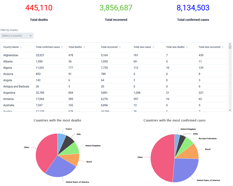
The global page features three counters at the top that are updated every few hours or so.
Underneath the counters is the global table. This table has all of the data from the countries for which there is data for. By default, the table is sorted by country name in alphabetical order, but it’s also possible to change the ordering by any column in increasing or decreasing order. I had the option of allowing users to sort by multiple columns, but I decided not to permit this in the interest of simplicity.
While it’s not too difficult to find a particular country (if it’s in the table), I’ve also added a dropdown list (a ComboBox if you’re familiar with Vaadin) that also only shows the countries for which there is data. Instead of searching through yet another list, with the dropdown list you can enter in a name of the country. I don’t know if the matching is fuzzy, but I’ve found it to be quite good.
Recently, I’ve also added grouping separators to separate the thousandths by a comma. Before this addition, it was quite hard to read some of the larger numbers. Besides this, I’ve left the styling as the default. I toyed with the idea of colouring certain cells, for instance if there is a particularly high number of new cases, but I quite like the simple look.

Below the table are two pie charts: one to represent the countries with the most COVID-19 deaths (see above) and the other to represent the split between the top 5 countries with most confirmed cases. There’s also a tooltip to show the exact figure.
As a nice not-quite-an-easter-egg easter egg, if you click on any of the pie slices, it moves out. I don’t see this being useful in any way. I just find it mildly amusing.
Country page

The global dashboard page was nice, but what if you wanted more information on a particular country? That’s where the country page comes in. There are three graphs that can be shown on this page: a graph that plots the total number of confirmed cases and deaths since the first case and death on the same graph, a graph that shows one or multiple countries’ confirmed case total and a graph that shows one or multiple countries’ total deaths. All three are area charts.
If you’re wondering what that blue dot is next to the dropdown list label, it means that the field is required (client-side validation). One of my gripes about the dropdown lists that show in this page is that they could show a country for which there is no data from the API I’m using, such as China or Australia (at the time of writing). This is unlike the dropdown list in the global page. From what I can see, this is a limitation of an otherwise good API. In the event that the user picks a country for which there is no available data, a notification message is shown for 5 seconds alerting them and asking them to choose another country.
Confirmed cases and deaths

It’s quite small, but along the X-axis are the dates. In the example above (you can try this yourself by searching for Austria – see the link at the bottom of the post), the days increment by two as there is a lot of data. When there is no need to condense the graph, the days increment by one. This graph lets you see how the number of deaths is a proportion of the number of cases visually. You can also toggle one of the series on or off by clicking on it in the legend. You could do this if you only to see, for example, the number of deaths for a given country.
Comparisons

While it’s worth pointing out that direct comparisons between countries should not be made without taking into the other factors that could be at play into account, it may be worthwhile looking at the rates to see how different countries are affected.
In the example above, the number of deaths in Italy and Spain are compared. You can compare more than two countries, but the graph may get a little hairy (but you can, of course, always toggle a particular country off).
Comparisons could also be made between countries for the number of total confirmed cases.
Technical side
The technologies used in this web app are Vaadin 14 and Spring Boot. It’s worth noting that I haven’t utilised any of the Spring features yet, but I plan to when I enforce SSL. If you’re interested, this project is open-source, so you can check out the COVID-19 Dashboard repository page on GitHub.
Vaadin
Vaadin was a pleasure to use. On the whole, the documentation is good, and the API is intuitive. I often find myself not needing to consult the javadoc for a particular class as I can find out how to do something from playing around with it after IntelliJ has suggested method names.
The Vaadin Charts API was particularly nice to use. I’m making use of my Pro license with the GitHub student pack. One of the downsides to using a commercial component is that it may detract away potential contributors. It also means that I may not be able to work on it myself after my license has run out if I don’t renew it (which I don’t think I will because of the hefty price tag).
I considered using Vaadin Designer to design the app quickly and exactly how I wanted, but I came into a bug that the dev team hadn’t come across before, so I ended up designing a simple UI in Java. If I can get it working, I may migrate to it. I also want to try out Vaadin testbench at some point.
Vaadin is really nice for making UIs in Java. That being said, I still would have liked to have known front-end languages so that I could have had finer grain control.
Continuous integration
I’m using Travis for CI, which is nice to use. I still find it satisfying to see the green build badge on the repository’s README. The tests are written in JUnit. Admittedly, I think I can do a better job on the tests in terms of coverage, so I’m still keeping my eyes peeled for places to refactor my code to make it easier to test more of it.
Third-party libraries
For retrieving the JSON, I’m using OkHttp3. Not much to say here, it works well. As an added bonus, the documentation for the API is in Postman, which shows the OkHttp code in Java (as well as other languages) to run. For parsing the JSON, I’m using JSON-Java. I could have used Gson instead, but JSON-Java suffices for my needs. I love the simplicity of JSON-Java.
The API limits the number of requests that can be made. To handle this, I’ve added caching with Caffeine. Caffeine was simple to use and it appears to be effective from what I can see.
For the unit tests, I had some private methods that I wanted to test. I didn’t want to not have unit tests, change the access modifier to open the methods up, have inner test classes (I want the source code and tests to be separate) or use getters. To this end, I found reflection to be handy here. I read that I could use reflection to access private methods, so I’m doing just that. This is probably controversial; perhaps an inner test class or refactoring the code to open more of it up would have been better. From a learning perspective, it gave me a chance to use reflection, though. For this, I’m using the Apache Commons 3 Lang.
Deployment
For where to deploy the app, I considered a number of the big players: AWS, Azure, Google Cloud Platform, Digital Ocean and Heroku. I ended up going with the latter just because they offered the nicest free tier, especially for students. I was blown away by how great Heroku is. The UI is nice, the documentation is good, free SSL if you’re a student and you have claimed your free Dyno and good customer support.
I’ve set Heroku up to deploy the app from the state in the master1 branch providing the commit in question passes the tests on Travis CI. This could just be a standard feature, I don’t know, but I think it’s nice regardless.
The Heroku URL was quite long, so I created a subdomain on my site and I made it point to the Heroku app.
See it
You can visit https://covid19.karankumar.com to see it running in the wild. For now, I’d recommend including the prefix ‘https://’ as I haven’t yet enforced SSL (but that’s coming soon).
It’s also featured in the GitHub Student Gallery.
Notes
- I didn’t realise ‘master’ came from from the master-slave model and had connotations with slavery. I’m glad GitHub is looking into changing this to be more inclusive.